Project Description

Digi Remote Manager is a comprehensive tool for IoT managers to determine the status and location of remote digital assets and deploy rapid updates anywhere in the world.
CHALLENGE
The project’s objective was to redesign the experience of two previously competing platforms (following an acquisition) while taking a “blue sky approach.” We joined the redesign effort in the role of Lead UX Designer following the formal research phase as project sprints were moving into design.
APPROACH
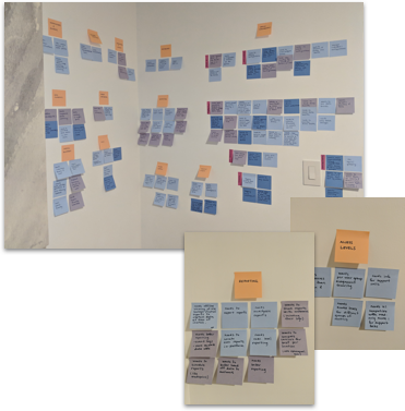
Our involvement began by analyzing and synthesizing the existing research to further define critical use cases and user flows. Wireframes were produced in the context of these flows for all essential development screens and synthesized for a final design pass with the team’s UI designer.
CONTRIBUTIONS
Task Analysis Optimization
User Flow / Scenarios
Wireframes
Implementation Documentation
DESIGN RATIONALE
Understanding user goals and tasks necessary to manage large networks of IoT devices provided the direction to progress. In addition to the previous research available to us, recorded demos from both product teams gave a unique insight into diverse approaches each had taken towards common challenges.

Further analysis of each product’s backlog and feature requests revealed meaningful stories that brought clarity to our direction, manifesting as user scenarios.
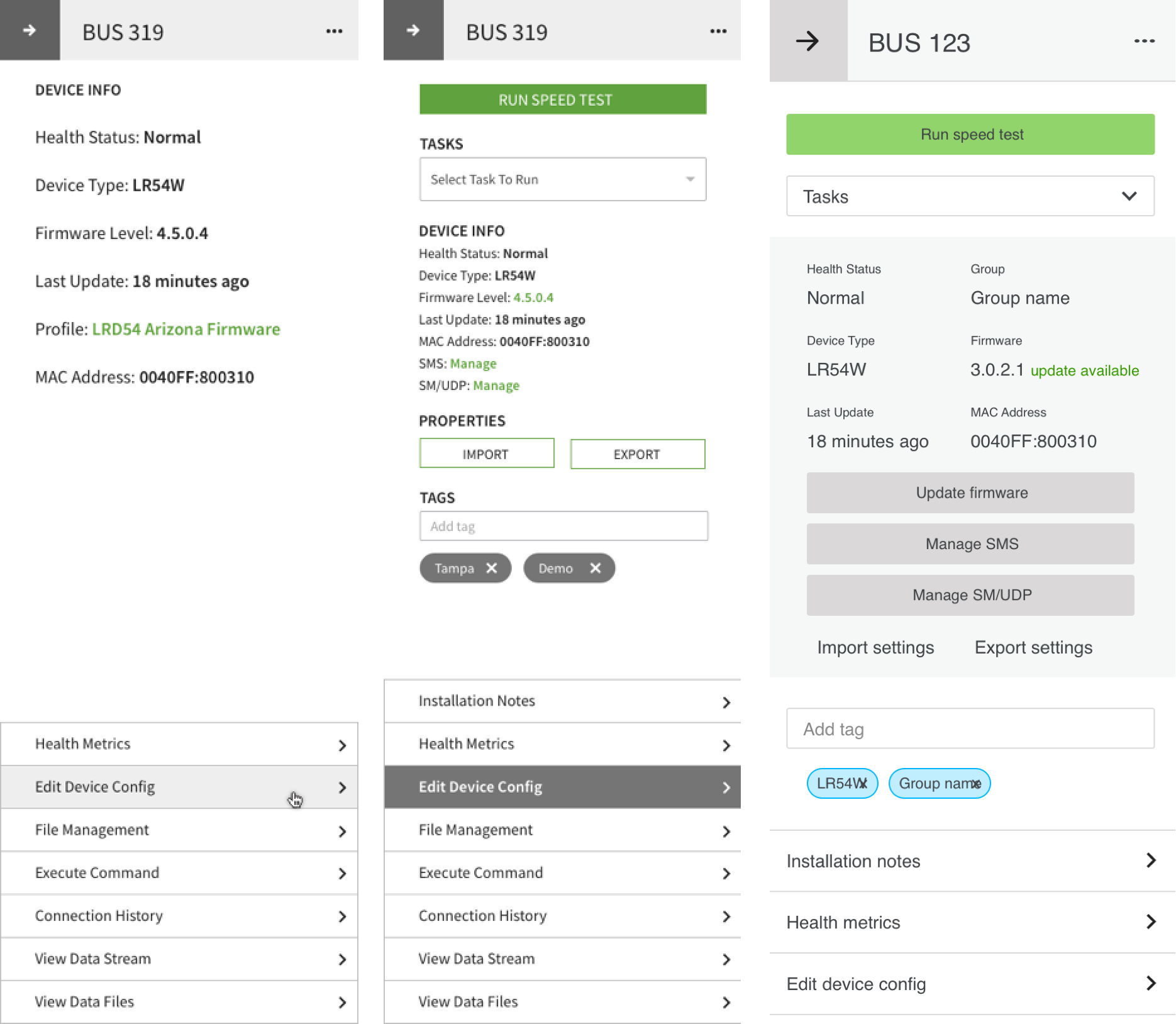
Within the context of these updated scenarios, we tested our orientation with the team by creating various design artifacts for alignment, most commonly as wireframe reviews of task optimizations.
During each weekly presentation, subject matter experts’ contributions provided invaluable feedback incorporated into the subsequent iteration. Allowing us to refine design while introducing new concepts each sprint.
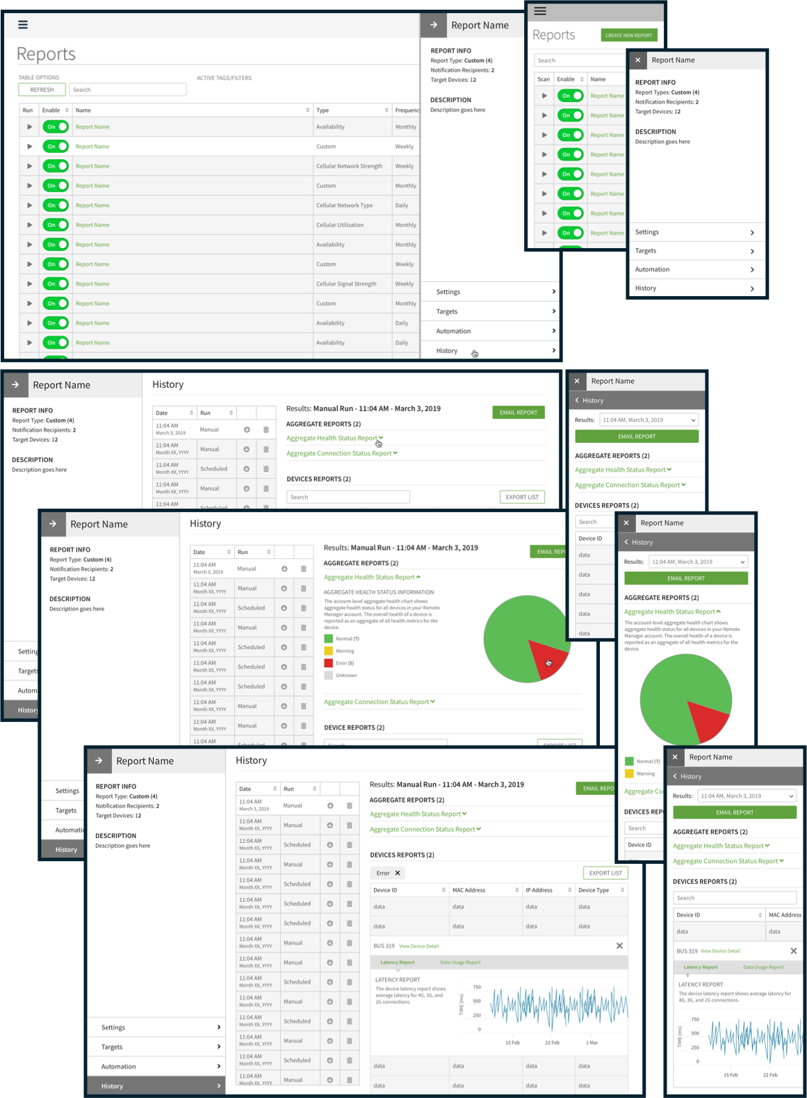
We designed each screen with responsiveness in mind. This example shows the desktop version of the Reports panel becomes a full-screen in its mobile counterpart. Also notable in this section is that the History of the reports has been condensed from a list view to a drop-down option to save screen space and support smart defaults (in this case, the most recent date) to provide users the knowledge necessary to complete their tasks.
This pattern, repeated throughout the platform, provides users an easily accessible anchor point from which to deep-dive into various categories without exiting their area of focus.
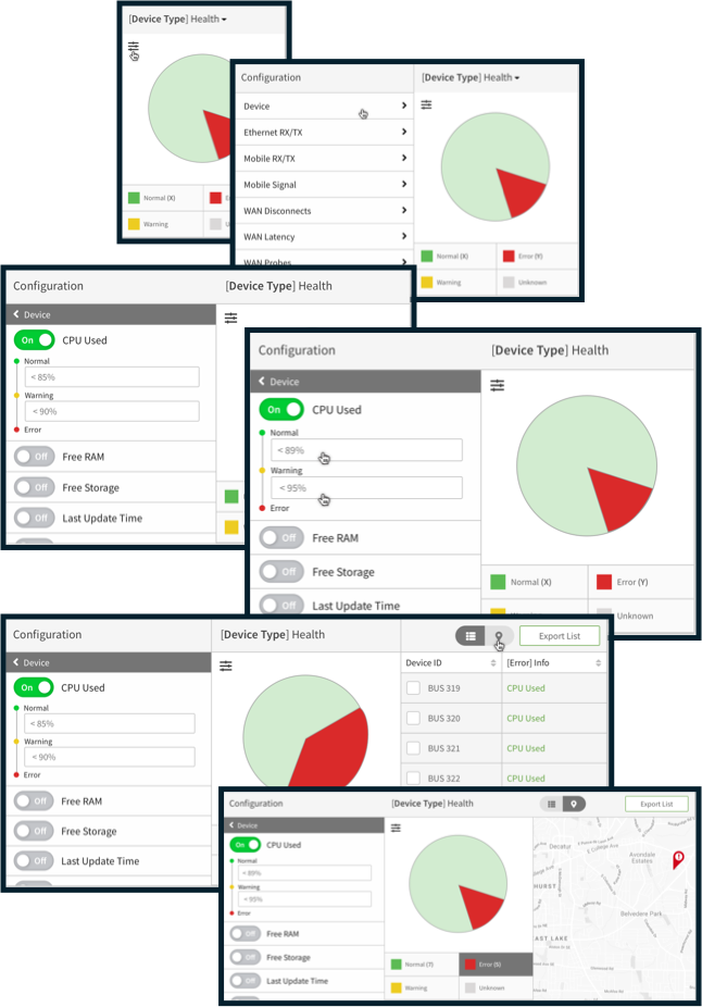
On the Remote Manager dashboard, users require their views to be versatile. Therefore, we designed dashboard widgets that grow in size as additional controls are needed to manipulate thresholds and investigate devices.
This scenario represents the user investigating devices with health errors, adjusting warning values from 85-90% to 89-95%. Device warnings can be investigated from a list or toggled to a map view prior to pursuing more advanced diagnostics.
This solution inspired so much enthusiasm from the client that two additional sprints were scoped to pursue additional use cases.
“Everything was clear and laid out during our weekly sprint review meetings, giving me confidence in the quality of their work. In fact, necessary changes in their design work were minimal.”


