Project Description

Apervita is the trusted healthcare collaboration platform for quality measurement, clinical intelligence, value optimization and interoperability. Apervita conducts more than 10 billion value-based computations and insights every year.
PROJECT: VARIABLE MAPPING
CHALLENGE
“User feedback indicates that current, real-world use cases around variable mapping may include hundreds of variables. Clicking “map” then selecting the asset UI (multiple clicks), then clicking “done.” is very cumbersome.”
APPROACH
After an audit of the platform’s existing capabilities and some additional user interviews, the following Problem Statement was crafted to begin defining metrics for success. Team alignment around the problem statement provided our effort a clear intent and direction.
“The current variable mapping isn’t meeting an Author’s need to manage assets with a high number of variables (e.g. > 100).”
CONTRIBUTIONS
User Research and Interviews
- Problem Statement
- Task Analysis and Optimization
- Handoff Designs
Implementation Documentation
DESIGN RATIONALE
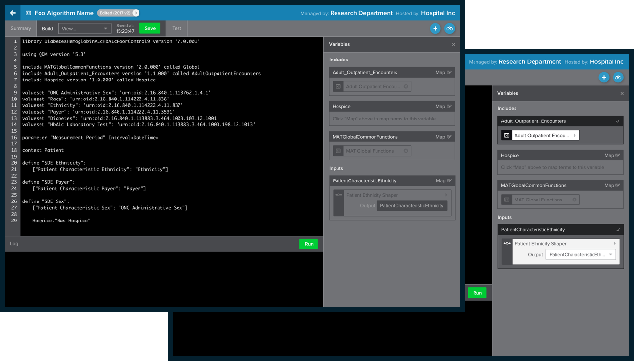
These screenshot examples of the old variable mapping panel provides evidence supporting the ‘cumbersome’ observation regarding the clicks to “map” and “done”. However, at this point we still needed additional research to ensure we are solving the correct problem(s).

Following an in-depth functionality audit, user interviews were conducted with our internal team. As is typical during the research phase we identified several other frustrations in addition to the initial observation.
These interviews resulted in the following considerations and evolved problem statement to steer our Orientation moving forward.
We believe that in order to properly manage an algorithm’s mapping an Author needs to be able to:
- Map a variable with less clicks
- Easily find a variable
- Organize variables by mapped/unmapped status
- See platform versioning
- Inspect another asset in it’s detail
- Quickly re-use previously mapped algorithms (and define a new output)
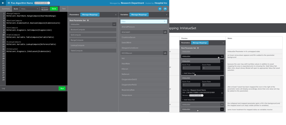
We continued to display variables alphabetically within the panel (something positive identified in research) and introduced a filter (from an existing design pattern) within the panel to more quickly find and map desired variables.
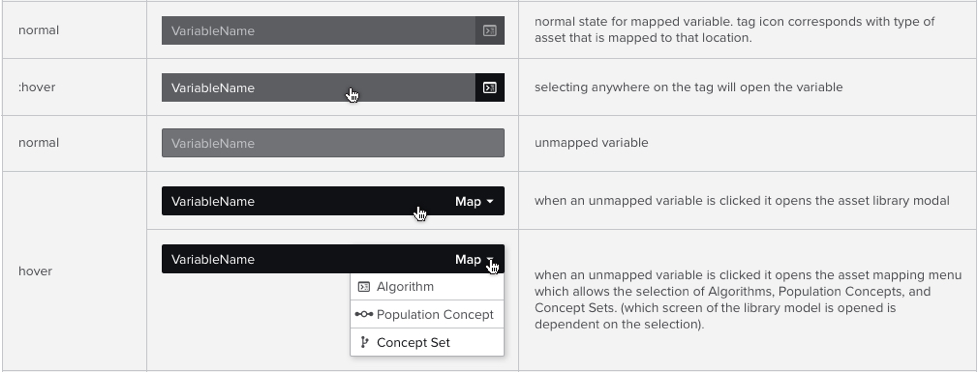
Previously, the panel required navigating a complicated asset modal to begin mapping variables. Our solution eliminated several clicks (a minimum of 3 depending on user intent) by elevating the asset type declaration (algorithm, population concept, concept set) as the trigger for the mapping action.
Originally, a mapped variable would remain in an expanded state displaying relationships and outputs. Interviews identified this depth of information as unnecessary at this level and obtrusive to the panel’s organization.
Considering this new information from our interviews, we reconfigured variable overview information from data best communicated as detail on demand. Combined with new visual cues such as icons and fills on the variable tags resulted in a flattened panel design and reduced the clicks necessary to map a variable by 50% (from 6 to 3), and the number of analytics visible increased from 7 to 17.

This new design increased the number of analytics visible within the panel at once from 7 to 17 as well as addressing the need to visually differentiate between Assets with a valid mapping and those without.
Each feature added to the variable module was examined within the context of our identified scenario of 100+ variables and weighed against common task sequences.
As we dove deeper into the functionality for the expanded panel, versioning information was identified as a requirement for any optimized workflow in order to avoid confusion between variables.
Additional solutions toward user frustrations included links to mapped assets, a predefined output selector, and a quick remove for old mappings.
PROJECT OUTCOME
Optimizing the panel for common task sequences identified in our user stories resulted in a flattened panel design, which decreased the number of clicks to map a variable by 50% (6 to 3). Additionally, the number of analytics visible within a screen (a significant pain point identified during research) increased from 7 to 17.
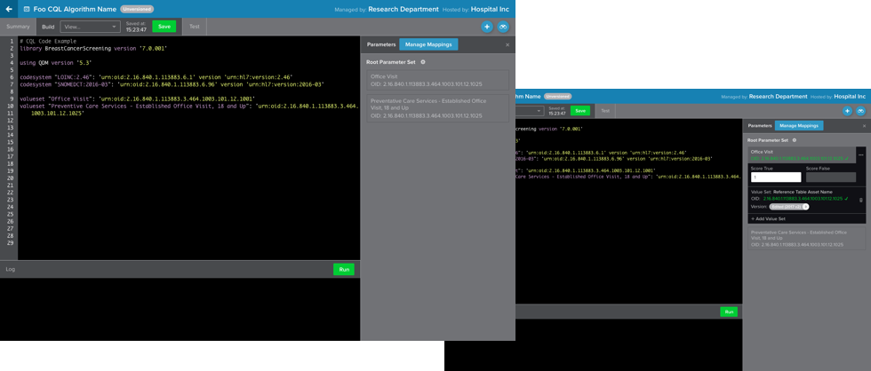
The original scope was limited to the Variables panel. However, the design was successful enough to warrant a complete refresh to all (3) panels within the code editor (Variables, Parameters, CQL).


